How Color Psychology Impacts Your Cosmetics Boxes
The cosmetics industry heavily relies on aesthetics to sell products. Without beautiful packaging, why would anyone expect your products to beautify their face? It might sound vain, but in this industry, you judge a book by its cover. So, how do you make your packaging attract more potential customers? Look no further than custom cosmetics boxes! These bespoke boxes are sure to make heads turn. They’re entirely customizable, meaning you can alter their size, shape, color, and design. The first step in designing your custom packaging is choosing the color scheme that represents your brand best. This article will discuss how color psychology can impact your sales and draw more attention from potential customers. Let’s get right into it!
Color Psychology
When you choose a color scheme for your custom cosmetics packaging, you should know what different colors say about your brand. Color psychology is an essential part of branding, especially for a cosmetics brand. Here is a guide that outlines the most important colors and how they represent your brand.
White
White is the most minimalist option your brand can go for. You can show off your product classy, allowing it to speak for itself. White is a popular choice amongst cosmetics brands as it can be coupled with any color to create an elegant look.
White also allows for more readability with text and relevant information printed on your custom cosmetics boxes.
Black
Black signifies sophistication and authority for your brand. Like white, you can couple black with almost any color to make it look exquisite. It also adds a sense of luxury to your product. Using metalized fonts on matte black gives a very royal look to your brand.
Red
Red signifies a lot more than just anger. It adds the feeling of excitement and passion to your product packaging. Consumers will feel more strongly toward your products if you use red. However, please don’t overdo it as it can be an abrasive color.
Blue
Blue is a very tranquil color to use for your packaging. It is one of the most comforting colors for consumers and does not disrupt. Furthermore, it also signifies dependability, making a positive impact on your potential customers. It is also a beautiful color; I mean, who doesn’t like shades of blue?
Green
Green is the perfect color to represent eco-friendly packaging. It also represents your product in a healthy way. Green has a significant impact on consumers as they will always relate it to health and environmental awareness.
Brown
Brown is, at times, a difficult color to use and is not necessarily recommended for custom cosmetics boxes. However, with brown packaging, you can signify that the material used is eco-friendly and recyclable. This can also have a great impact on your potential customers.
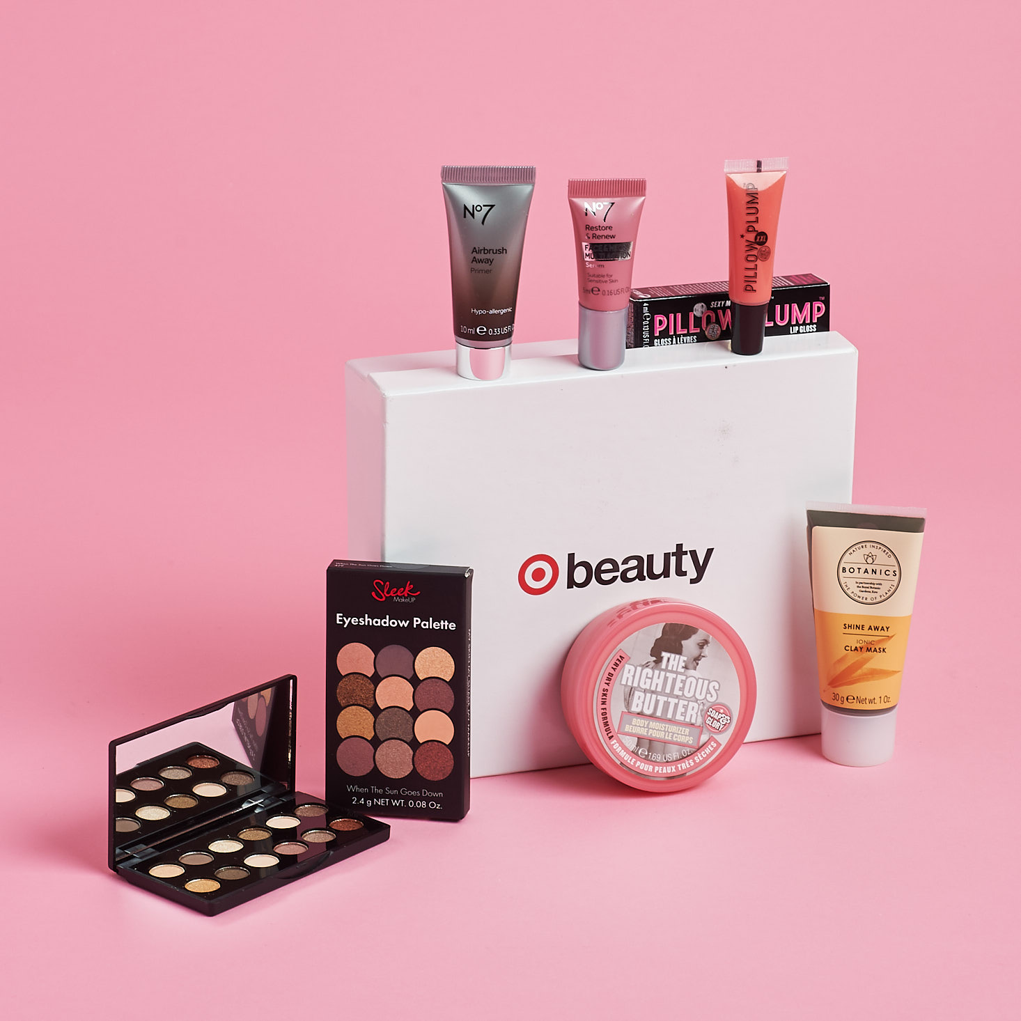
Pink
Pink is one of the best colors to use for your custom printed boxes. It signifies beauty and elegance, especially when coupled with white. Pink is a very popular color in the cosmetics industry, with many large brands using it very often.
Conclusion
This was a guide to help you make the right decisions while designing your custom cosmetics boxes. Although there are more factors, focusing on these initially will get you on the right track to decide the perfect color palette.
Picking out a color scheme is much more meticulous than it looks. It takes proper planning to pick out colors that blend well together and complement your brand. Once you have the perfect color scheme for your cosmetics brand, you’ll see the difference in sales and profit! So, invest now and ensure you make the right decisions for your color palette.